

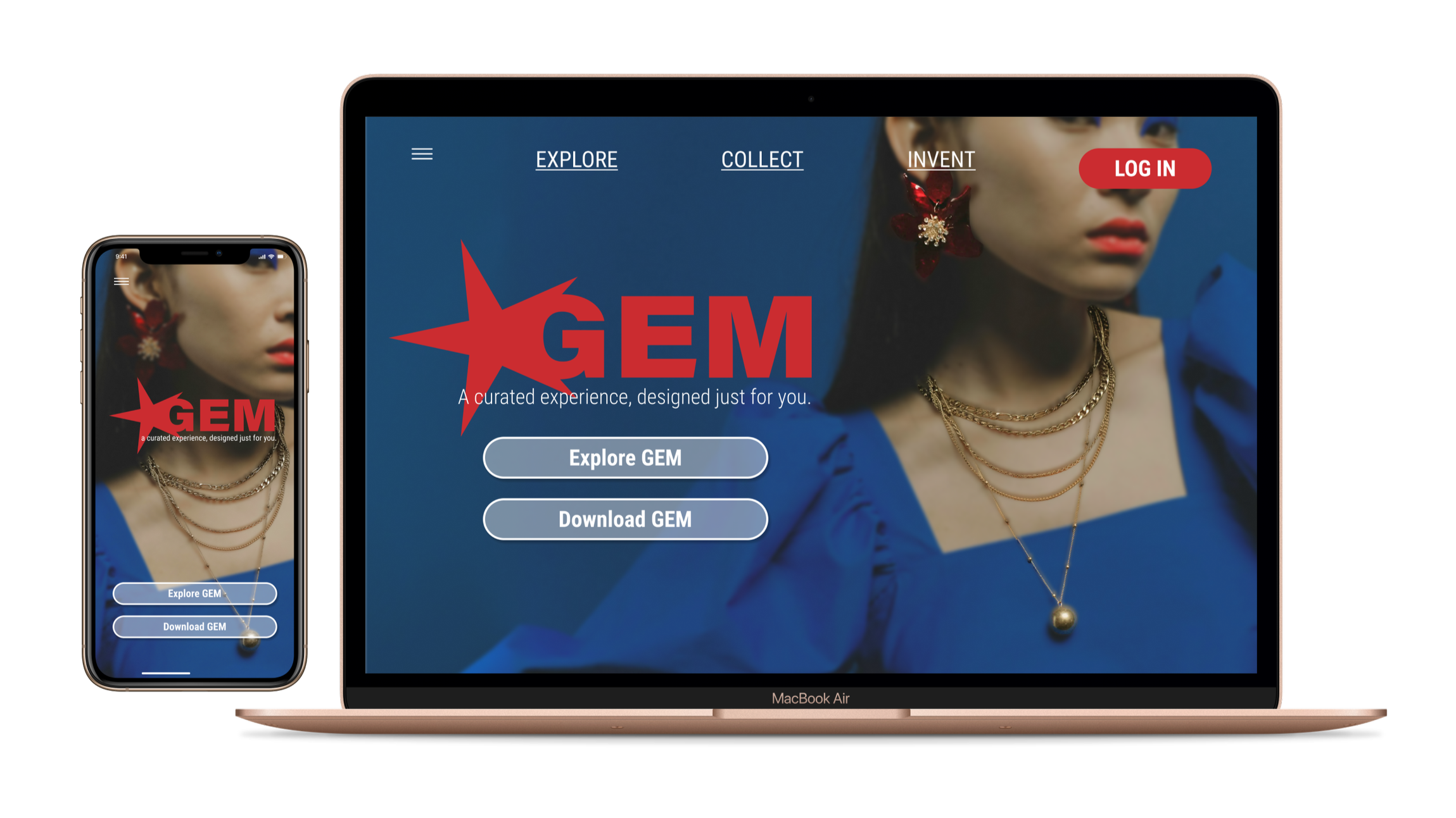
Designed by Katelyn Patio & Adara Balabanow
EXPLORE THE REALM OF GEM AND CHOOSE YOUR ARCHETYPE.

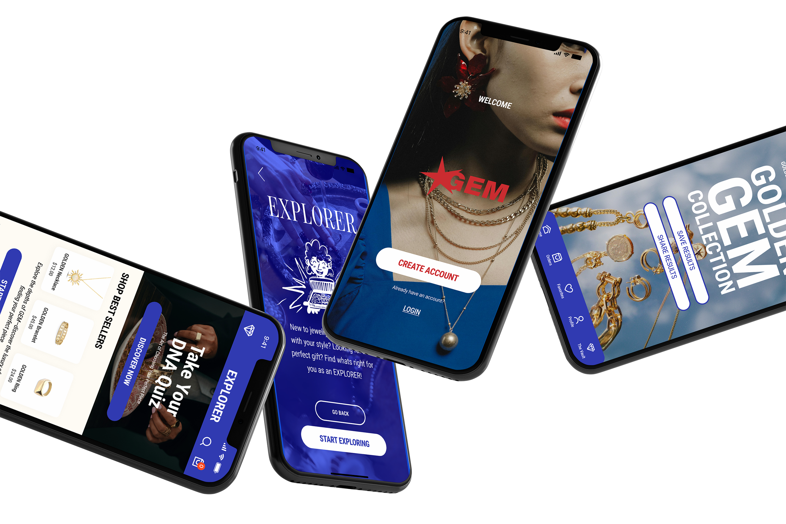
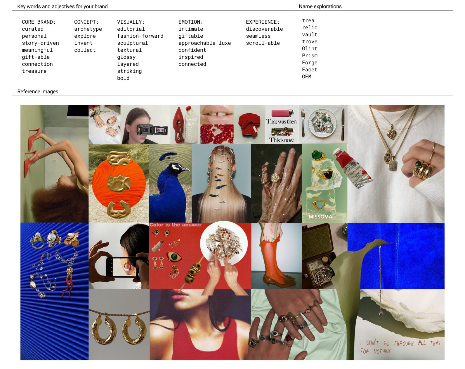
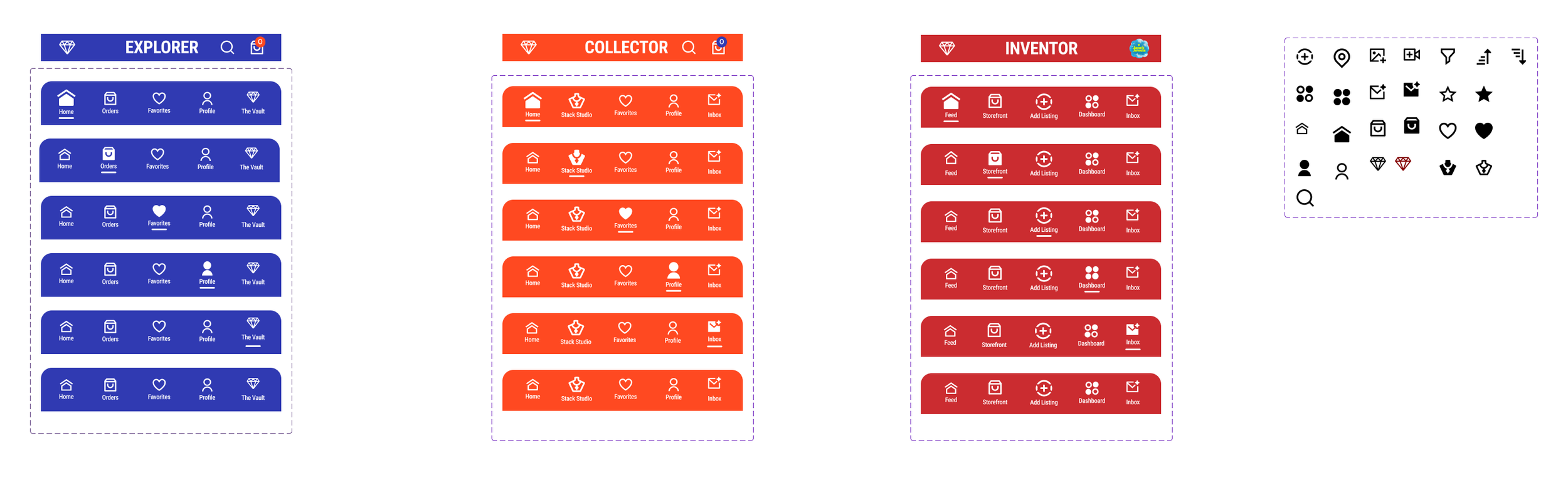
GEM is a curated jewelry ecosystem app that replaces the cluttered experience of mass e-commerce with a focus on community and craft. The platform is built on a circular economy where independent artists and shoppers connect through a shared interest in sustainable design.We designed the app around three specific user archetypes that each offer a tailored experience to best fit each persons needs:
THE ARCHETYPES
EXPLORERS.
The Curious Discoverer
New to jewelry or still figuring out their personal style
Looking for meaningful gifts or easy ways to browse
Prefer a simple, guided shopping experience without overwhelm
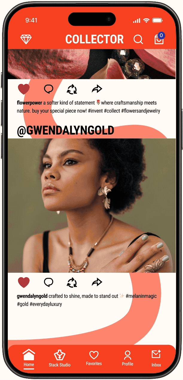
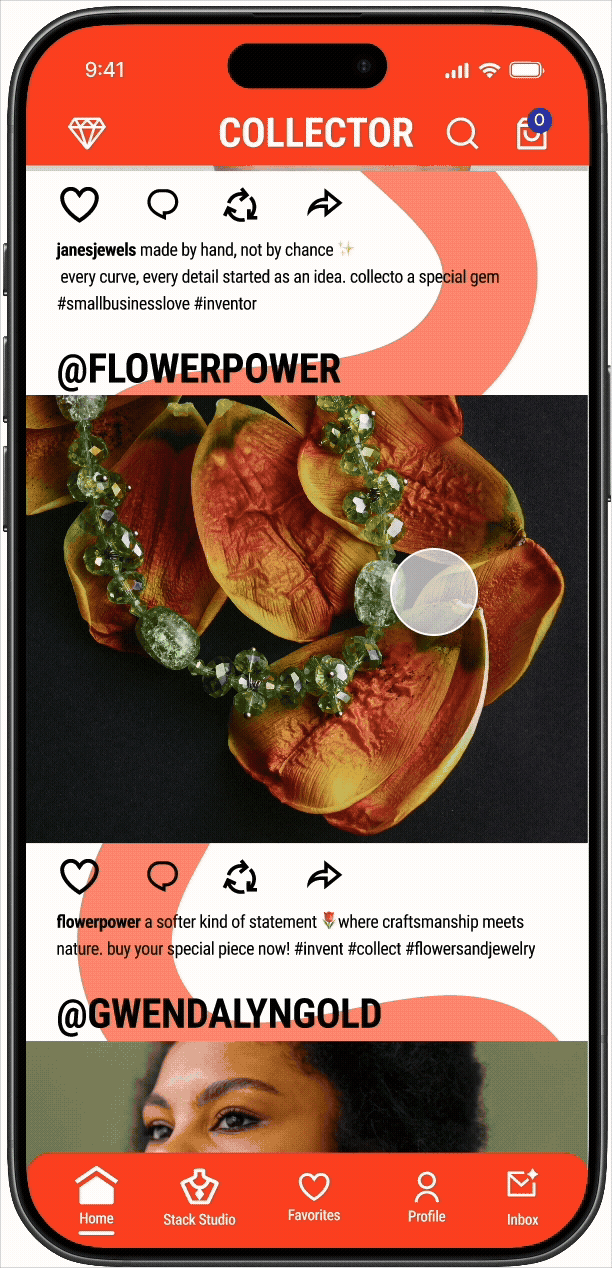
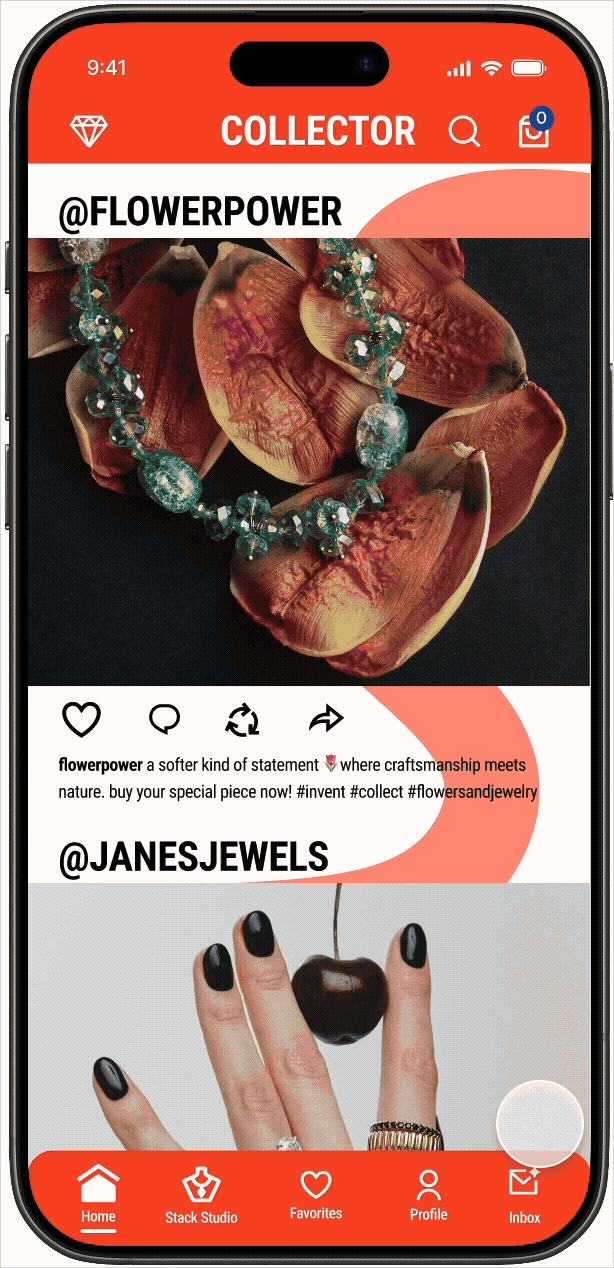
Discover new brands, styles, and eventually unlock “The Vault” to become a Collector
COLLECTORS.
The Creative Maker
Passionate jewelry lovers with established personal taste
Build, showcase, trade, and sell pieces from their collections
Enjoy a deeper, more community-driven experience within GEM
Use the platform to connect with others who share similar aesthetics and interests

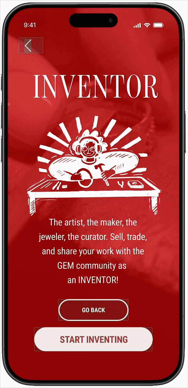
INVENTORS.
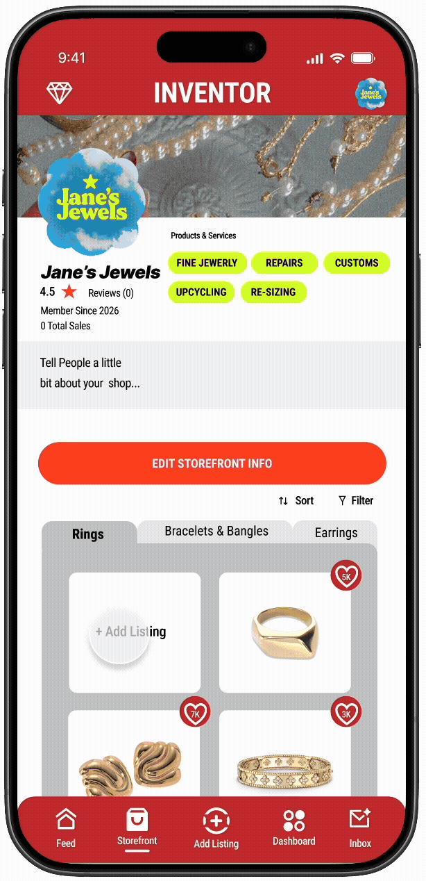
The Intentional Curator
Independent artists, designers, and small business owners
Create, customize, and manage their own storefronts on GEM
Share behind-the-scenes content, launches, tutorials, and creative process
Collaborate, trade, and engage directly with Collectors and the wider community

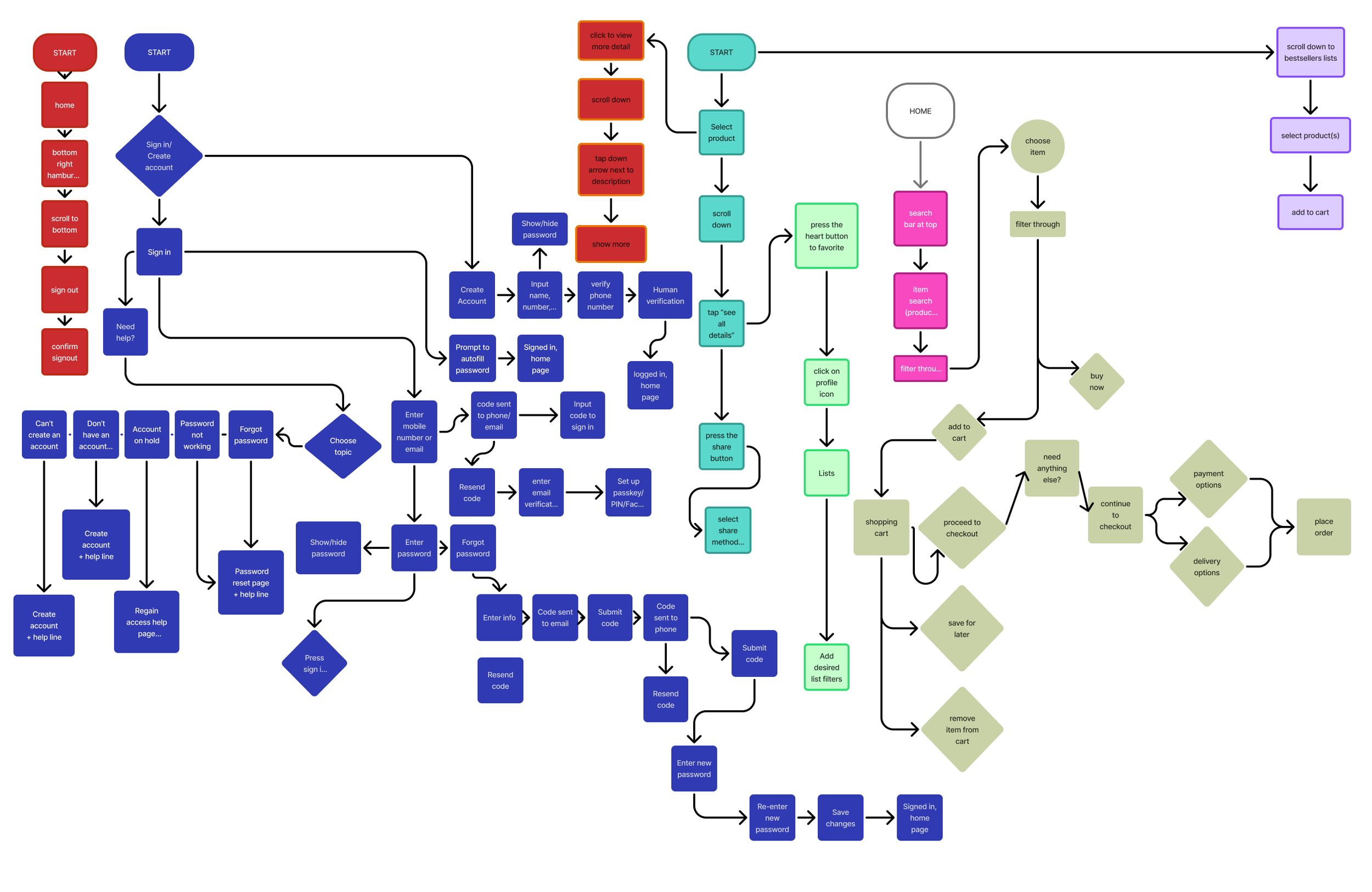
THE FLOWS
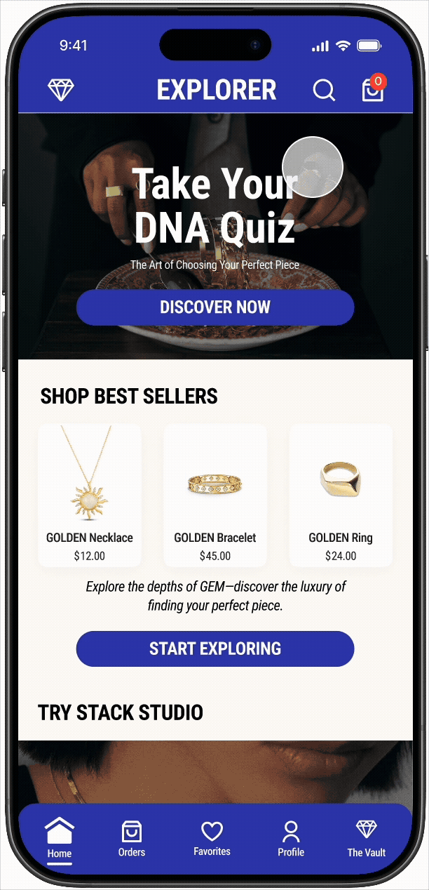
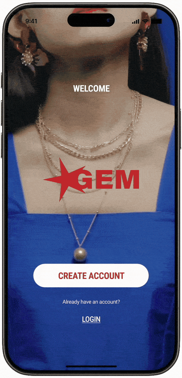
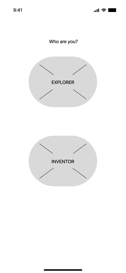
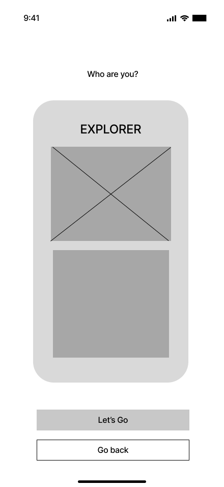
EXPLORER ONBOARDING
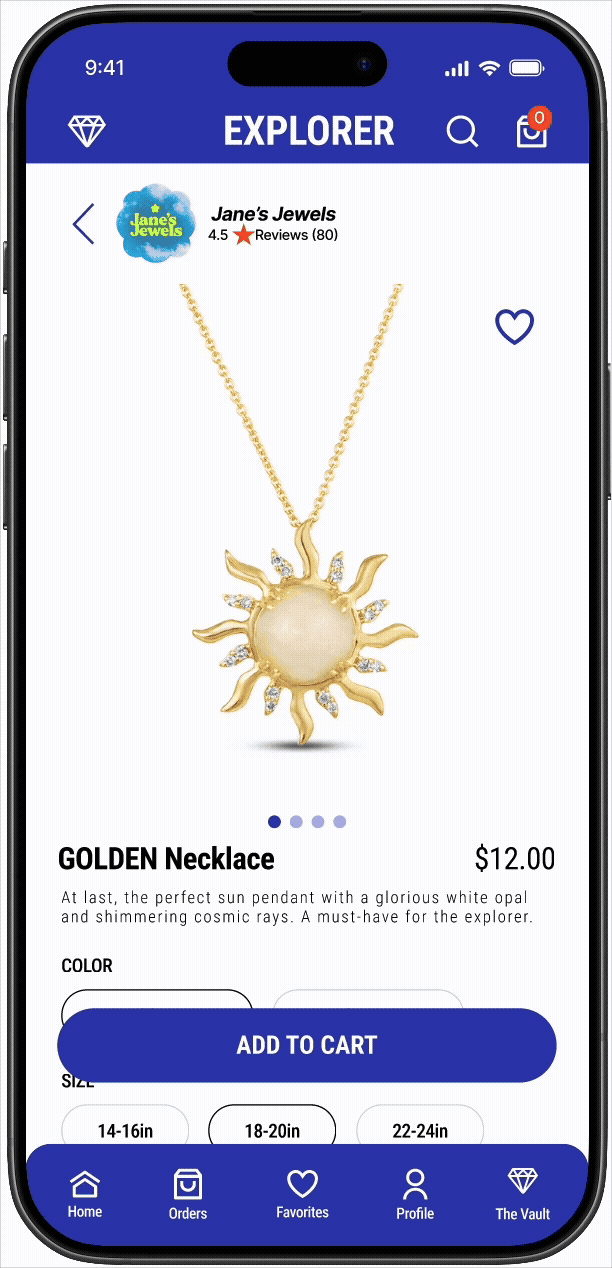
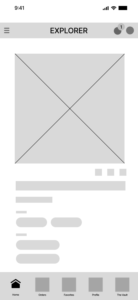
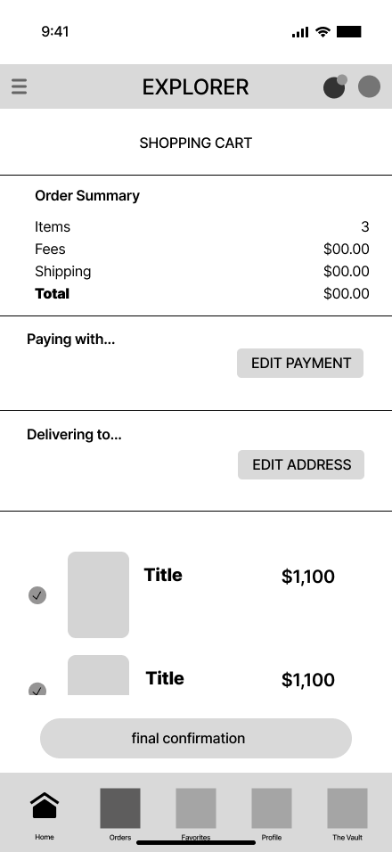
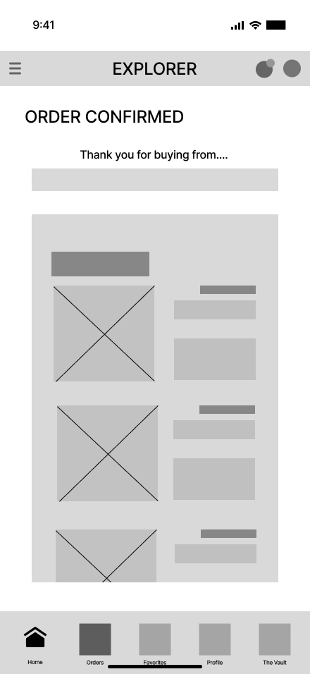
ADD TO CART
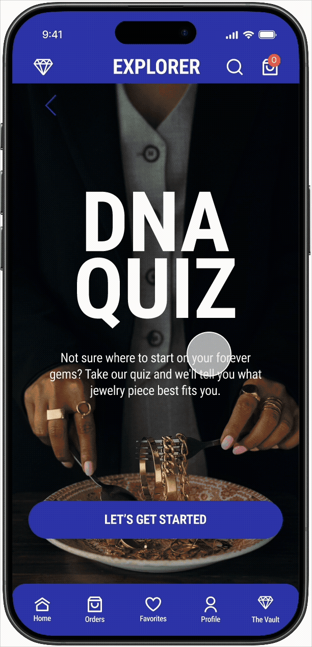
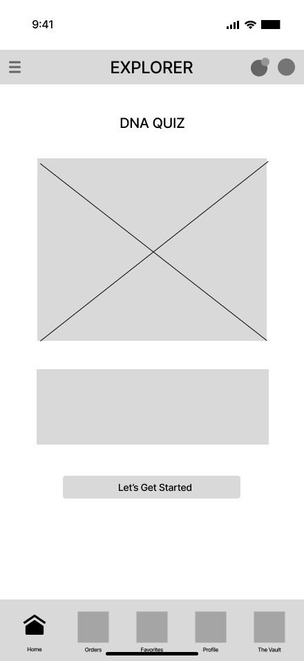
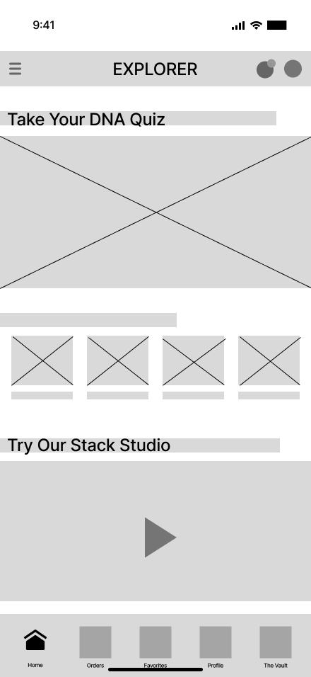
DNA QUIZ
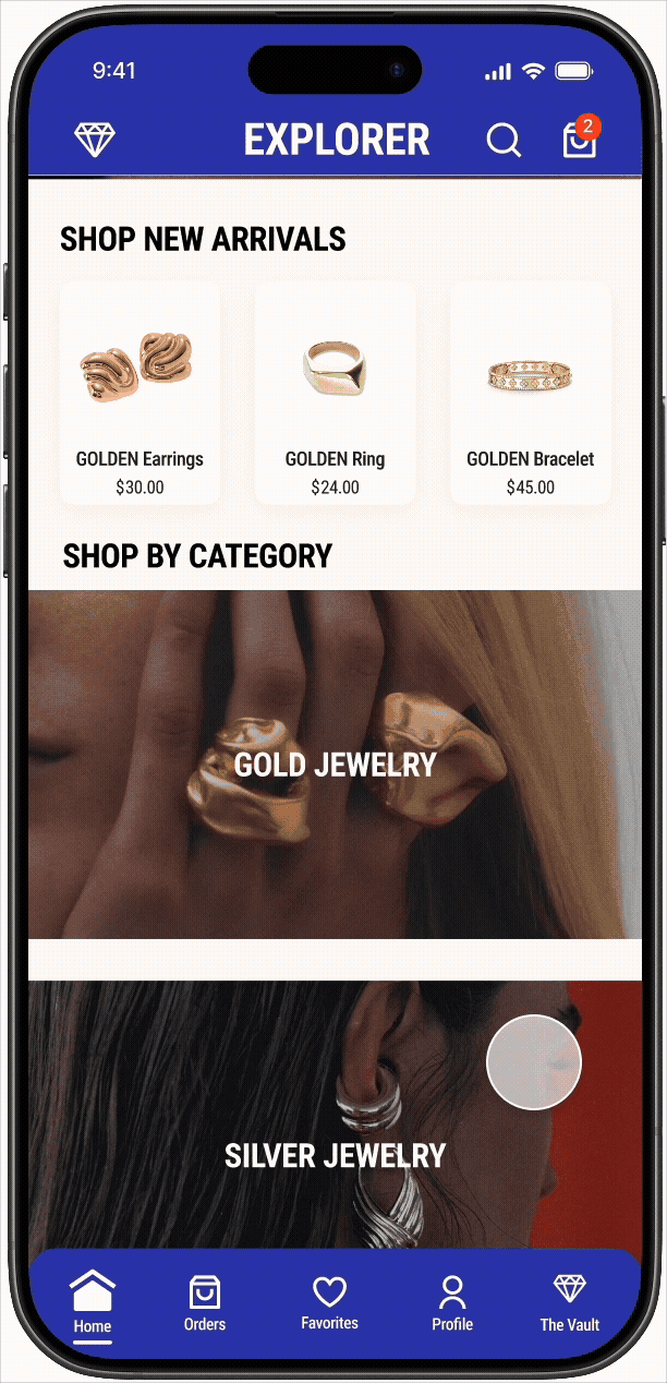
DISCOVER THE VAULT
CUSTOMIZE COLLECTION
MAKE AN OFFER
LOG OUT
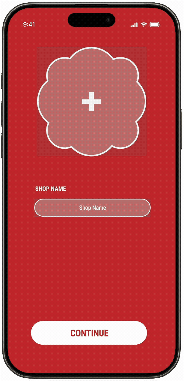
CREATE A LISTING
MAKE A TRADE

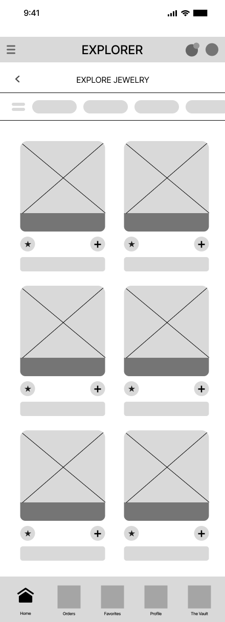
EXPLORE LISTING
SETUP USER PROFILE
INVENTOR ONBOARDING
RESEARCH
During this phase, users were interviewed on their shopping preferences and a competitor analysis was conducted on the users' most used shopping app, which was Amazon. A user flow of the competitor's app was then created along with a value proposition for the developing consumer app.-
USER 1
M, 26, Computer Science Student / Tennis CoachWhen shopping for jewelry, what apps/websites do you turn to first? “My go to app for most products would have to be Amazon. I like to see what they have available before looking into other websites. If there’s no item of interest, then I’ll resort to using google/tiktok to research and look up where to find the jewelry I’m looking for”
How often and what time of day do you use the app and are there specific holidays or events around which you shop more? “If I’m really interested in getting a specific piece of jewelry, I’ll look throughout the day to visually look at the item. Typically, I’d say I’ll be on the app at night after my day because that’s when I have downtime. Holidays or events like birthdays would be the most common reason for purchasing jewelry.”
What’s most appealing about the app? “Convenience of finding many items with a simple user interface. It’s extremely user friendly for all ages to use without difficulty.”
What’s the hardest part or is there any concerns about using this app? “Aside from the occasional time when items are not in stock is the only concern. Overall, the Amazon app has little no to no concerns.”
Was there anything surprising or unexpected about the app? “I’d say there’s nothing to my surprise with this app. They have a lot of utility of options like saving items and having a convenient search engine”
What can be done to improve the app? “The general use of the app is practical and simple for any user. In terms of improvement, there’s not much I’d say needs to be improved currently.”
What feature of the app do you use the most? “The search engine is fairly accurate in terms of what I’m looking for. When there’s an item that I want to buy, it is simple to add to the shopping cart and easy to purchase.”
When you shop on this app what is the ratio of time you spend window shopping vs actually purchasing items? “I would window-shop more than I buy most of them time when using the app. I would have a item in mind and like to look for the best product as time goes on to see if there’s anything new or better for me. Once I put my items in the shopping cart, I will always buy them right away.”
Have you gifted anyone jewelry lately and if so where did you get it? What was it? “Yes, I’ve recently purchased some necklaces and a ring from a website called Flaire & co. which is a website. The items took about a week to arrive and the packaging was simple. The items themselves are nice and exactly how they looked online. Overall, a great purchase and a website I would use again.”
USER 2
24, Full-time Student/Part-time BaristaWhen shopping for jewelry, what apps/websites do you turn to first? “I usually start with Instagram to discover brands, but when I’m actually ready to buy something, I almost always check Amazon. It’s just reliable. I’ve also bought from Flaire & Co and I browse TikTok Shop a lot because the video reviews help, but Amazon is probably the most consistent for me.”
How often and what time of day do you use the app and are there specific holidays or events around which you shop more? “I browse a few times a month, usually at night when I’m just scrolling in bed. I shop more when I have an event coming up like a birthday dinner, vacation, concert, or something where I need a specific piece. I also buy everyday staples if I feel like I’m missing something in my daily rotation.”
What’s most appealing about the app? “With Amazon, it’s the reliability. I know it’s going to ship fast and arrive when it says it will. The reviews are helpful and I like being able to compare a lot of options quickly. It feels efficient. I’d say I’m pretty tech savvy, so navigating it isn’t hard for me.”
What’s the hardest part or is there any concerns about using this app?“ Amazon can feel really cluttered. There are so many listings that it’s hard to tell what’s actually good quality versus what just has good photos. It can feel overwhelming. Also, if there’s ever an issue, it’s not super easy to find a real customer service agent. It feels very automated, which can be frustrating.”
Was there anything surprising or unexpected about the app? “Sometimes I’m surprised at how good the quality can be for the price, especially for simple gold jewelry. Other times I’m surprised by how many nearly identical listings there are, which makes it harder to choose.”
What can be done to improve the app? “Curation instead of just endless listings. Better filtering for materials and durability would make it easier. Making customer service more accessible and easier to reach would also improve the experience.”
What feature of the app do you use the most? “I use the search bar and filters the most on Amazon. I also add things to my cart and let them sit there while I decide.”
When you shop on this app what is the ratio of time you spend window shopping vs actually purchasing items? “Probably 70 percent browsing and 30 percent buying. I definitely spend a little too much sometimes, but if I know I’ll wear it for an event or daily, I’ll ponder and eventually get it.”
Have you gifted anyone jewelry lately and if so where did you get it? What was it? “I mostly shop for myself, but the last time I gifted jewelry it was a simple gold necklace from Flaire & Co. It was minimal, cheap, and everyday wearable, which felt safe but still thoughtful.”
USER 3
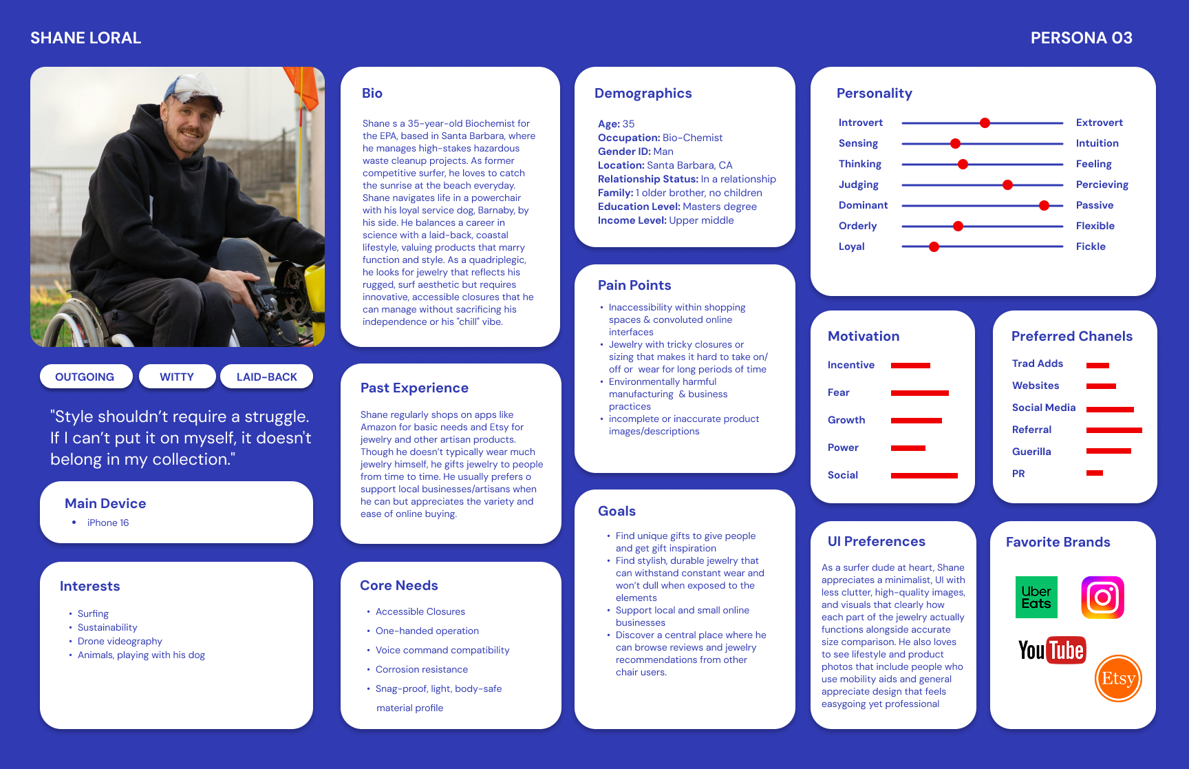
M, 35, Bio-chemistWhen shopping for jewelry, what apps/websites do you turn to first? “I usually start with local brands or boutiques if I can then look on Etsy or Amazon because their accessibility features work well for me. I occasionally check other sites if I’m looking for something specific”
How often and what time of day do you use the app and are there specific holidays or events around which you shop more? “I mostly shop in the evenings after work or on the weekends, once or twice a week for necessities. I do more shopping around birthdays, anniversaries, and the winter holidays.”
What’s most appealing about the app? “The accessibility options are so helpful. Being able to have pretty much anything I need delivered within a reasonable timeframe has saved me from so much stress. The large selection, clear product information, and overnight shipping make it pretty convenient. Everything is in one place as opposed to a dozen different stores all over town that may or may not have what I need.”
What’s the hardest part or is there any concerns about using this app? ”Sometimes it’s hard to see fine details through photos, or products don't have adequate descriptions. Comparing similar items can also be tedious.”
Was there anything surprising or unexpected about the app? “It seems like they are always rolling out fancy new features and shortcuts.”
What can be done to improve the app? “Better zooming on product images, clearer size references, and more detailed descriptive information for accessibility would help.”
What feature of the app do you use the most? “Search filters and the wishlist feature for sure. I like to save items and review before making the decision to buy.”
When you shop on this app what is the ratio of time you spend window shopping vs actually purchasing items? “About 80% browsing, 20% purchasing.”
Have you gifted anyone jewelry lately and if so where did you get it? What was it? “I have not gifted anyone jewelry recently.”
USER 4
F, 16, High school studentWhen shopping for jewelry, what apps/websites do you turn to first? “Amazon”
How often and what time of day do you use the app and are there specific holidays or events around which you shop more? ”I shop whenever i feel like it as i do not have a set time, i usually shop more around Christmas for gifts”
What’s most appealing about the app? “I think the most appealing thing about this app is that it has a diverse selection of items”
What’s the hardest part or is there any concerns about using this app? “There’s not really any concern that comes to mind while using this app”
Was there anything surprising or unexpected about the app? “No, there is nothing surprising or un expecting about this app”
What can be done to improve the app? ”I’m not sure there’s anything that can be done to improve the app experience”
What feature of the app do you use the most? “I use the shopping feature most as it is a shopping website”
When you shop on this app what is the ratio of time you spend window shopping vs actually purchasing items? “I browse more than i purchase i usually spend no more than thirty minutes looking at items”
Have you gifted anyone jewelry lately and if so where did you get it? What was it? “No I have not”
-
Type of Application:
App and web (Hybrid)Main Objective:
Sell as many subscriptions and products as possible and do it fast.Overall tone or mission:
“To deliver unparalleled customer value, convenience, and speed”
“Earth’s most customer -centric company”
“At Amazon, design matters most when it reaches everyone”Main features:
Category specific shopping, registry, gift guides, grocery, pharmacy, books, shopping guides, AI ”interests” feature, 3D product viewing, personalized AI styling tips with ability to view on model selected by the shopper, Amazon Lens, Alexa, Amazon Haul (under $10)Areas of Amazon reviewed positively:
Prime membership perks, overnight shipping, grocery delivery, wide range of products, easy checkoutAreas of Amazon reviewed negatively:
Too much going on/very cluttered, too many sponsored adsTarget demographic:
a very wide range of people of most ages, abilities, nationalities, jobs, etc. Anyone with purchasing power or connection to someone with purchasing powerUser interface:
Home: Ads, separation by categories, recommended, holiday deals
Orders: Orders, returns, buy again, Account, Lists
Your cart: your cart, saved for later
Settings: Shortcuts, explore, shop by category, settings
Rufus AI: questions and answers -
See below!
-
Users shared frustrations with cluttered shopping apps, overwhelming product options, unclear material details, sizing uncertainty, and low trust in resale platforms. We’re creating a curated, artist-forward jewelry app that combines AR stack styling with a trusted resale exchange to make shopping more creative, transparent, and sustainable. By spotlighting independent designers and small businesses, our platform turns jewelry buying into a meaningful, confidence-driven experience rather than a cluttered, transactional one.
personas, flows, & wireframes
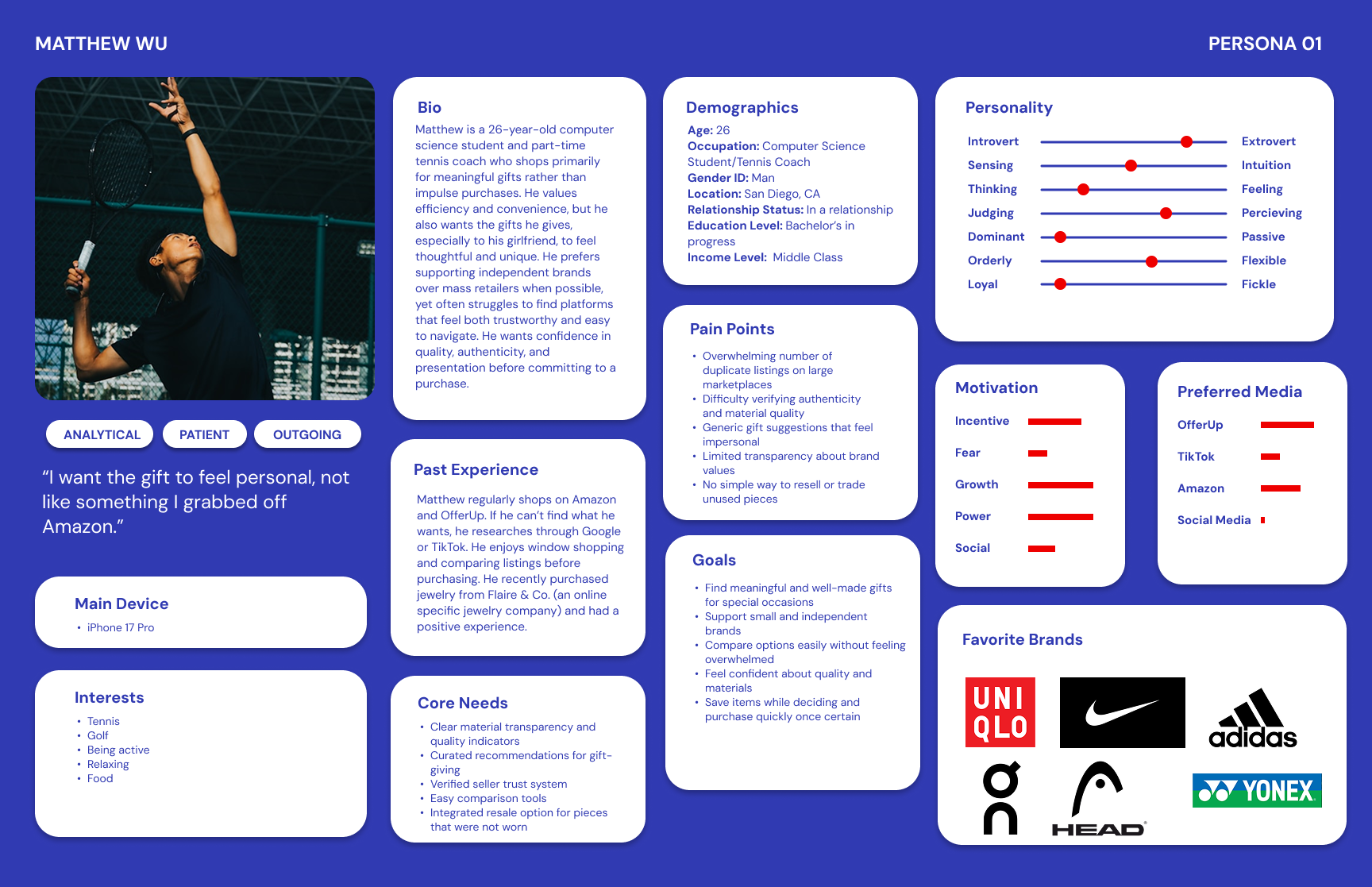
Four personas were created based on the user interviews, highlighting their frustrations with their preferred shopping app. Low-fidelity wireframes were created for the developing app and a user flow was constructed using these wireframes.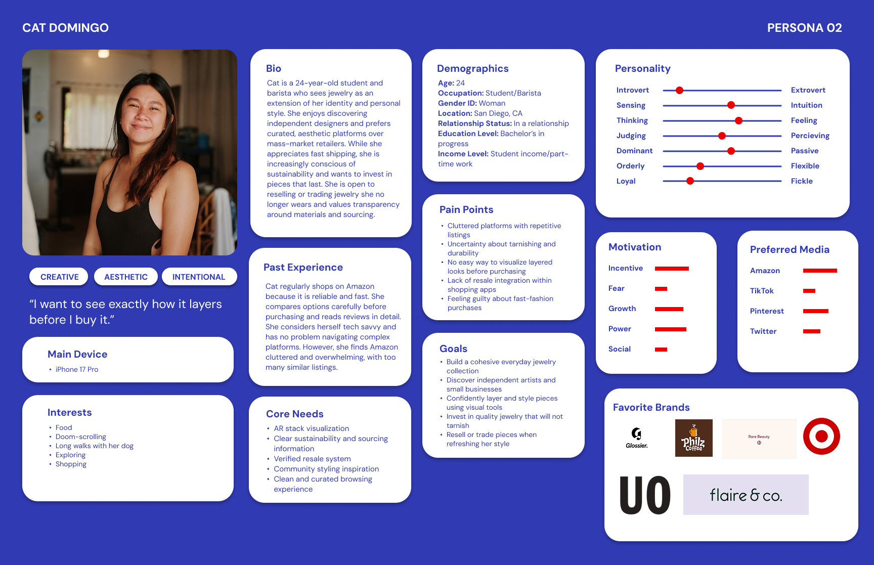

INITIAL USER TESTING
An initial user testing was conducted with the same users that were interviewed using the low-fidelity wireframes, which was used for a data analysis. Feedback on the developing app were taken into account and updates were made accordingly.-
After seeing the choice between 'Explorer' and 'Inventor' during sign-up, how did you interpret those roles, and did you feel one clearly represented your goals?
When adding an item to your cart, you had two different ways to do it (the button or the '+' icon). Which one felt more natural to you, and was there any confusion about what the '+' symbol would do?
As an 'Inventor,' how easy was it to find your shop analytics and orders? Was there any information you expected to see on that dashboard that was missing?
The app offered a style quiz to match you with jewelry. On a scale of 1–5, how likely would you be to complete that quiz before browsing, and what would you expect the app to show you afterward?
If you wanted to list a new piece of jewelry for sale right now, how confident do you feel that you could find the starting point without help? What part of that process felt the most or least clear?
Was anything confusing while using the app?
Was it easy or hard to find something you liked?
Did you know what to do next at each step?
Was anything hard to use or unclear?
Would you use this app to shop? Why or why not?”
-
User 1 – Mike, Male, early 20s, college student, tech-savvy, frequent online shopper.
Key Feedback
Tended to press everywhere and was confused when buttons were not clickable.
Got stuck using the hamburger menu because the touch area felt too small.
Found the login process easy and straightforward.
Preferred the Explorer route because it felt more natural and user-friendly.
Felt the “+” icon for adding to cart was more intuitive than the existing button.
Said he would complete the DNA/style quiz out of curiosity and expected accurate personalized recommendations.
Thought the app was straightforward overall, but needed refinement and fewer prototype bugs.
Mentioned the app may feel confusing for older or less tech-savvy users.
Wanted more accessibility and flexibility when selecting categories and exploring products.
Said he would use the app once fully completed because the products and visuals were appealing.
Main Takeaways
Mike focused heavily on usability and interaction issues. His feedback highlighted the importance of larger touch targets, clearer navigation, and making interactive elements feel more responsive and complete.
User 2 – Cat, Female, early 20s, college student, casual shopper, less tech-confident.
Key Feedback
Understood Explorer as browsing/shopping and Inventor as creating or selling jewelry.
Chose Explorer first because it felt more straightforward.
Preferred using the “+” icon to add items to the cart because it felt more familiar.
Felt somewhat confused when exploring the Inventor side and did not fully understand what certain sections meant.
Would likely take the style quiz to receive personalized jewelry recommendations.
Did not feel confident listing jewelry and said she would need to click around to figure it out.
Found some buttons confusing because they looked similar but performed different actions.
Said it was easy to scroll and browse, but sometimes unclear where to go next.
Frequently tapped around to understand what actions were available.
Would use the app if it felt more polished and easier to understand.
Main Takeaways
Cat’s feedback revealed issues related to clarity and onboarding. She needed more guidance, clearer button hierarchy, and stronger visual cues to help less tech-confident users navigate comfortably.
User 3 – Sean, Male, mid 30s, Bio-chemist, moderate online shopping experience.
Key Feedback
Thought the Explorer role fit his needs best and understood the purpose of both roles clearly.
Had difficulty finding certain navigation paths, especially shop analytics and dashboard tools.
Expected shop orders to appear in the hamburger menu with analytics.
Rated the style quiz positively and liked the idea of personalized recommendations based on style and budget.
Felt confident listing jewelry despite the low-fidelity prototype.
Said the app felt straightforward overall, but would benefit greatly from color and icons for clearer navigation.
Thought the “Schedule a Drop” feature was cool and intuitive.
Became frustrated when prototype elements were not clickable or interactive.
Mentioned there were no actual listings or product photos, making browsing feel incomplete.
Said he would use the app to support artisans and discover niche jewelry styles.
Main Takeaways
Sean focused on navigation structure and feature organization. His feedback emphasized the importance of visual hierarchy, interactive realism, and making marketplace content feel populated and engaging.
User 4 – Lucia, Female, early 20s, casual online shopper.
Key Feedback
Felt Explorer and Inventor seemed like part of the same overall experience.
Found adding items to the cart confusing.
Said analytics and information pages were easy to locate and understand.
Would probably start the quiz but might leave midway to browse independently instead.
Wanted an option to exit the quiz early.
Preferred choosing her own filters instead of relying entirely on quiz results.
Felt confident she could post a listing.
Found the cart flow the most confusing area of the app.
Mentioned the lack of real product listings/photos made it difficult to connect with the browsing experience.
Said she would likely use the app overall.
Main Takeaways
Lucia’s feedback showed the importance of flexible user flows. She preferred freedom in navigation and browsing, suggesting the app should support both guided discovery and independent exploration equally well.
-
I. What were the demographics of each user you interviewed?
User 1 (Mike): Male, early 20s, college student, tech-savvy, frequent online shopper
User 2 (Cat): Female, early 20s, college student, casual shopper, less tech-confident
User 3 (Sean): Male, Mid 30s, Biochemist, doesn’t really wear jewelry, tech savvy.
User 4 (Lucia): Female, mid 20s, Ceramic artist, seller, fairly confident with tech.
II. What were the main challenges users had for each flow?
Flow 1 (Login / Create Account)
Overall, users found the flow easy to complete
Some confusion around onboarding language and role selection (Explorer vs Inventor)
Users wanted clearer “Continue” buttons and more distinction between “Continue” and “Skip for Now”
Flow 4 (Add / Remove from Cart)
Some users struggled to locate products and therefore had difficulty reaching the cart flow
The “Add to Cart” button lacked visibility and was harder to find
Users preferred the “+” icon because it felt more natural and familiar
Users instinctively expected a swipe-to-delete interaction similar to other shopping apps
Flow 11 (Unique Flow – Quiz / System Navigation)
Users generally enjoyed the quiz experience
Some confusion occurred when navigating between systems and features
Users had limited understanding of the Inventor/Collector ecosystem
Certain buttons and navigation paths were unclear or incomplete, causing users to get stuck
The Vault and Collector mode felt somewhat unexplored
Posting listings felt straightforward and users appreciated the detail included in listings
III. What surprised you during the interview regarding user feedback?
I was surprised by how differently each user interacted with the app depending on their level of technical confidence. Mike, who is very tech-savvy, navigated quickly and pointed out smaller usability issues, while Cat struggled more with navigation and understanding button functions. This made me realize that interactions that seem intuitive as a designer may not feel intuitive to all users.
I was also surprised that users still expressed interest in using the app despite encountering multiple frustrations and navigation issues during testing. This showed that the core concept and value proposition of the app were appealing enough to keep users engaged even when the prototype had flaws.
IV. What did you learn from the overall experience and what do you plan to improve?
I learned that small usability issues can quickly compound into larger roadblocks that disrupt the user experience. Designing for a wide range of users, especially those with different levels of tech familiarity, is extremely important. I also learned that redundancy and consistency in navigation can help users feel more confident when interacting with unfamiliar systems.
Based on the feedback, I plan to:
Improve button clarity and consistency throughout the app
Increase visibility of important actions like “Add to Cart”
Add clearer onboarding instructions and role descriptions for Explorer vs Inventor
Fix broken or incomplete navigation paths and remove “dead ends”
Make text boxes fully interactive and typeable
Revise hamburger menu organization and accessibility
Increase tap target sizes for easier interaction
Add swipe-to-delete functionality in the shopping cart
Improve overall hierarchy and navigation between app systems
V. Will the improvements to these flows benefit other flows of the app? If so, how?
Yes, these improvements will positively impact the entire app because the app functions as one connected ecosystem. Improving navigation clarity, accessibility, button hierarchy, and interaction patterns will create a more seamless and user-friendly experience across all flows. Fixing roadblocks and improving consistency will help users better understand how to move through the app overall, making all features feel more intuitive and connected.
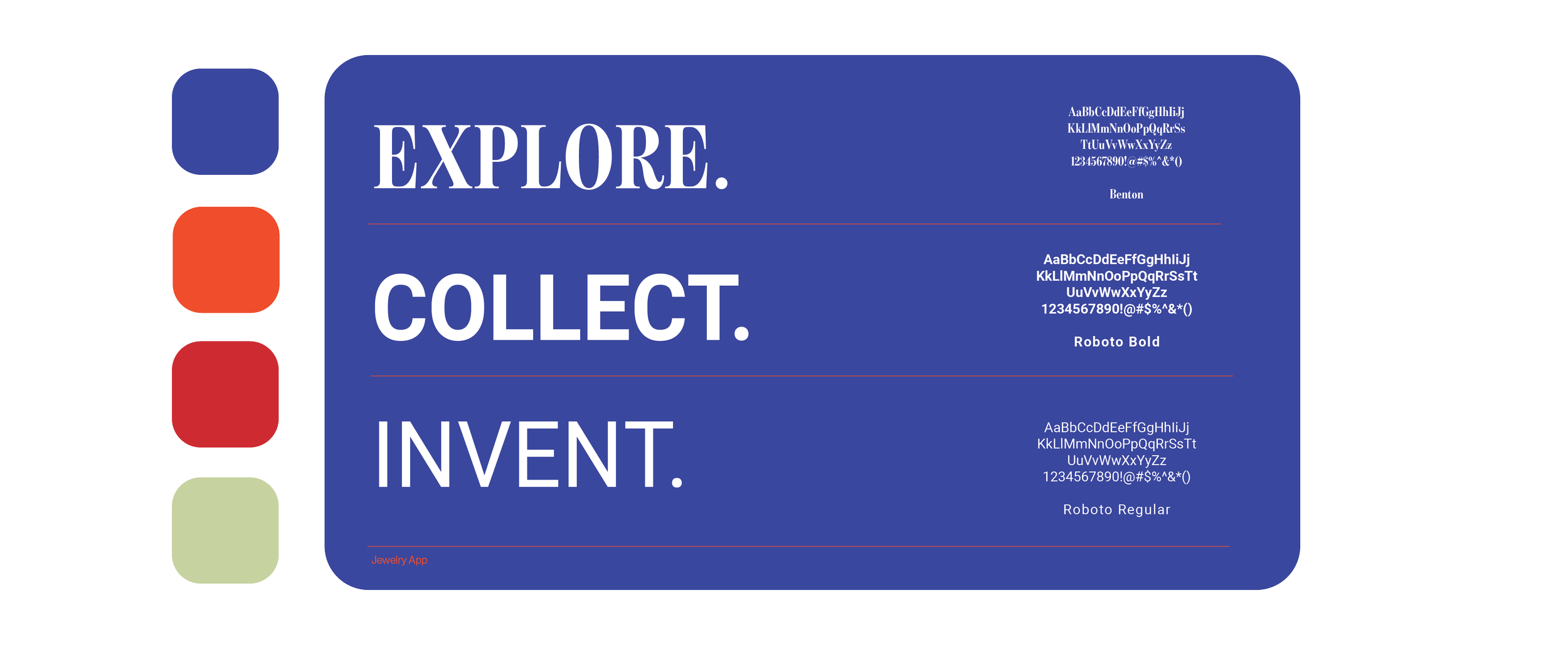
visualizing identity & design applications
FINAL USER TESTING
One last round of user testing was done with the high-fidelity designs. Feedback from the testing was then applied to the final app design.-
What did you think of the layout of the content?
How easy was it to make an account and did you understand the difference between the archetypes?
What did you think of the overall app experience? Is this something you would use?
Can you tell me what you thought of the “new listing” layout (for the inventor) or the “add to cart” layout (for the explorer)?
Did you feel as if anything was missing or unclear?
Who will you be interviewing?
Mike, Explorer, testing explorer onboarding, taking the dna quiz, add to cart
Lucia, Inventor, testing the inventor onboarding & “add new listing” flow
-
User 1 – Mike
Archetype Tested: Explorer
Flows Tested: Explorer onboarding, DNA Quiz, Add to CartNotes: Mike moved through the app quickly and understood the Explorer vs. Inventor paths right away. He described the layout as straightforward and easy to follow. During testing, he clicked on almost every interactive element to test functionality, which helped reveal a few usability issues. He noticed that some smaller buttons, especially the back/return icon, had a limited hit box and occasionally required multiple taps.
He found the DNA Quiz engaging and easy to complete, though he mentioned that adding a “go back” option between questions could improve the experience. The add-to-cart flow worked smoothly for him, including accurate cart updates when deleting items. Overall, he felt the app was visually cohesive, functional, and comparable to other shopping platforms. He said he would use the app, especially because of the personalized discovery experience through the DNA Quiz.
Interview Questions & Responses
1. What did you think of the layout of the content?
“UI is easy to follow and straightforward. Visually, it is captivating and gives the user many options to work with. Both the Explorer and Inventor options are functional to purchase items and list products to sell. Some of the interactive buttons have a small hit box on mobile which can be hard to progress. Overall, the app is close to being a fully functional website that is simple to navigate around.”
Follow-up: What about the icons?
“The icons are 90% operational to my knowledge. The majority of the large icons are easy to interact with and have multiple functions such as saving and adding to cart. The only potential issue could be the return page icon that is slightly small to hit so I’d have to press multiple times for it to work.”
Follow-up: What about the verbiage and fonts?
“Verbiage and fonts are easy to read. I haven’t come across any misspelled words or sizing issues. From my interpretation, all of the wording is legible and captivating to the eye. Nothing looks bland or out of place.”
2. How easy was it to make an account and did you understand the difference between the archetypes?
“It was straightforward to make an account since you start with two choices. The archetypes make sense if someone wants to purchase or sell products. The simplicity of getting to either homepage is easy to do and is different based on the choice of Explorer or Inventor.”
3. Can you tell me what you thought of the DNA Quiz and adding to your cart?
“The DNA quiz is interactive and consistent when selecting answers. Being able to go back is not an option but once you progress it is simple to manage and fun to see which options the user is presented with. Adding items to cart is clean and has the correct functions of adding the total products. It also has the proper calculations when deleting the item as well.”
4. What did you think of the overall app experience? Is this something you would use?
“The app overall is well made and easy to understand. When compared to other websites, this app is almost no different and has all the functionality and properties needed to get the user influenced to buy products. I would use this app since the DNA test is a fun way to find out what items I’d want to look for.”
5. Did you feel as if anything was missing or unclear?
“From what I can tell, the app is clear and doesn’t have many missing items to work on. Aside from not allowing people to put in a full user applicable login and the ability to purchase real items, the app is basically operational from my perspective.”
User 2 – Lucia
Archetype Tested: Inventor
Flows Tested: Inventor onboarding, Add New ListingNotes: Lucia was asked to create an account and add a new listing to her shop. She moved through the entire process seamlessly and fairly quickly. She understood where to click and followed the prompts without difficulty. At first, she was slightly unsure about the text fields because they were clickable instead of typeable, but once it was explained that the prototype auto-populates information when tapped, she adapted easily.
She talked through her thought process while navigating the app and generally found the experience smooth and intuitive. After completing the listing flow, she pointed out that the image gallery page indicators at the bottom were not updating correctly when switching between photos. Aside from that issue, she described the onboarding and listing process as quick, visually appealing, and easy to understand.
Interview Questions & Responses
1. What did you think of the layout of the content?
“I thought it was very easy to understand. The colors were comforting, the photos were as expected and visually appealing.”
Follow-up: What about the icons?
“Yeah, everything seemed easy to see and natural.”
Follow-up: What about the verbiage and fonts?
“The verbiage made sense and the fonts were not distracting in a negative way so I didn’t really think about them. They were definitely legible so I appreciated that part. I think I would have noticed them if they were causing an issue, but I didn’t.”
2. How easy was it to make an account and did you understand the difference between the archetypes?
“It was very easy and yes, the difference between the two account types was very clear and straightforward.”
3. Can you tell me what you thought of the ‘New Listing’ layout?
“I thought it had a nice interface with the photos and stuff and it was understandable and easy to maneuver through and, again, the colors were appealing.”
4. What did you think of the overall app experience? Is this something you would use?
“I definitely would use it because I felt like it was really easy. I didn’t get stuck at a bunch of places, which can be deterring. The onboarding process didn’t take too long, it was simple and easy. The style images made sense and the information options all looked good.”
5. Did you feel as if anything was missing or unclear?
“I didn’t feel like anything was missing, it was pretty smooth and simple to get started. I really appreciated the fact that what I just did only took a couple minutes and now I could theoretically be up and selling things already. It was great!”
-
User 1 – Mike
Archetype: Explorer
Demographic: Mid-20s, male, computer science student and tennis coach, very tech-savvy, regularly uses apps like Amazon and other online shopping platforms.
Main Challenges During Testing
Mike did not encounter any major challenges, but he did notice that some smaller icons, especially the back/return button, were harder to tap and sometimes required multiple attempts. He also mentioned that the DNA Quiz did not allow users to go back to previous questions, which slightly limited the experience. Aside from these issues, he was able to navigate through the app smoothly and complete all tasks without confusion.
What Surprised Me During Testing
Going into the test, I thought users might be confused by the dual archetype system (Explorer vs. Inventor) or overwhelmed by the number of options available. However, Mike understood the distinction immediately and navigated confidently through the app.
I was also unsure whether the DNA Quiz would feel unnecessary, but he actually found it engaging and said it made the app feel more interactive and interesting compared to other shopping platforms.
What I Learned & Planned Improvements
I learned that users naturally try to interact with almost everything on the screen, so consistency in clickable elements is extremely important. Even small usability issues, like button size, become very noticeable during testing. I also learned that a clear and simple layout helps users move through the app more confidently and efficiently.
For future improvements, I would:
Increase the size of smaller tap targets for better mobile usability
Add a back option within the DNA Quiz
Make interactive elements more consistent across screens
Turn text fields into real input fields to make the prototype feel more realistic and fully functional
User 2 – Lucia
Archetype: Inventor
Demographic: 26, woman, artist, semi tech-savvy, typically sells at art markets, has used apps like Depop and Etsy.
Main Challenges During Testing
Lucia did not experience any major usability challenges during the test. The only issue was that the prototype dimensions were slightly larger than her phone screen, so she occasionally had to scroll down to see the rest of certain pages. Other than that, she was able to move through the onboarding and listing flows smoothly without confusion.
What Surprised Me During Testing
Before the test, I was unsure about the effectiveness of the font sizes and the onboarding imagery, especially on the product and style selection screens. I worried that the fonts might appear too small and that the images would not clearly communicate each style option. However, Lucia said the visuals worked well and that the content felt understandable and visually cohesive.
What I Learned & Planned Improvements
I learned that consistency and simplicity help streamline user flows and allow users to complete tasks more efficiently. Keeping onboarding quick and straightforward creates a much more positive experience for users.
For future improvements, I would turn the text boxes into real input fields instead of tap-to-fill interactions. This would make the prototype feel more realistic and fully functional.